
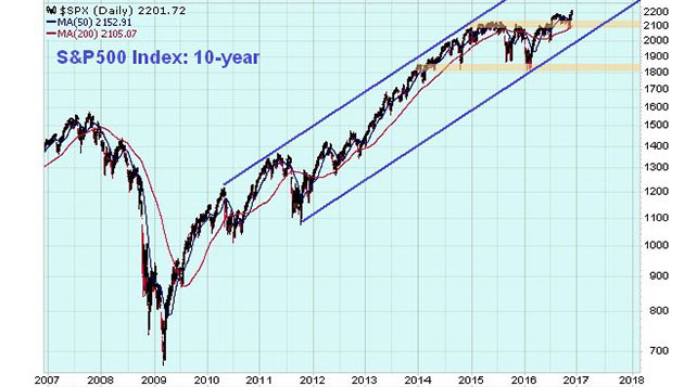
The broad U.S. stock market actually looks better overall than it has done for several years, which may come as a surprise considering it has been in a bull market since as far back as early 2009. On the 10-year chart for the S&P 500 Index we can see that a potential top area developed from early 2015 through the middle of this year, which has now been aborted by recent gains that have seen it break clear above resistance at earlier highs. This index remains within the big parallel channel that started to form back in 2010–2011 and appears to have its sights set on a run to the upper boundary of the channel again, which will result in BIG gains from the current level.
While we can speculate about the fundamental reason or reasons for such a move—a Trump spending spree, hot money flowing out of embattled Europe and possibly the Mid-East and Japan into the U.S., and helicopter money—such pondering is largely a waste of time; the chart says the market is set to advance and quite a lot, and that's what matters. This is a big change from several months back or even several weeks back, when it looked toppy and vulnerable.
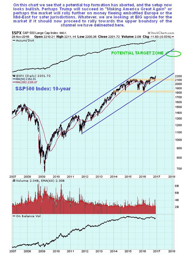
The 4-year chart enables us to see how the market gradually rounded over beneath a giant Dome pattern, but then broke clear above it in the spring of this year. Observe how, after this happened, and it advanced away from the Dome, it then dropped right back to test support at the Dome boundary before advancing again. This was a very deceptive move, given that it looked like it had topped out at the resistance at the highs, and thus was a buying opportunity that many missed out on. Like Russian dolls, a Dome pattern of lesser magnitude then formed during this year, which involved the market breaking out to new highs in the Summer before this Dome boundary forced it back down again, but Trump's unexpected victory caused this Dome to abort too, and after its recent sharp advance the market is now "in the clear," having risen well above the considerable zone of congestion approaching the 2015 highs.
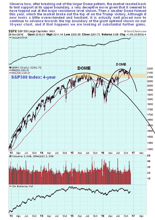
On the 1-year chart we can see how the market was being forced lower by the Dome pattern that developed this year, but suddenly broke out of it on the Trump victory on strong volume, which was a bullish development, and following the breakout it has continued to push higher, breaking its Summer highs at the top of the Dome as moving averages swing into bullish alignment.
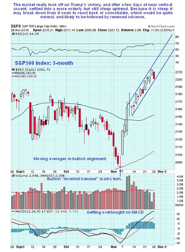
On the 3-month chart we can see recent action in detail and how jitters ahead of the election caused the market to drop sharply, until a bullish "inverted hammer" right at the 200-day moving average heralded a reversal, which occurred on the Trump victory when a gap up into a giant white candle signaled the birth of a new uptrend. After rising almost vertically for a few days, a move which punctured the Dome boundary, the market settled into a more orderly, if still steep uptrend. Now it is getting overbought on various oscillators so it would not be surprising to see it break down from this uptrend to enter a period of consolidation or reaction, although any reaction is likely to be minor before the larger uptrend resumes.
Conclusion: the market appears to be starting out on another major up-leg within the giant parallel uptrend channel shown on the 10-year chart above, on which you will also find a prospective target for this uptrend, that is a long way above current levels. If this interpretation is correct, any short-term reaction will present a buying opportunity.
Clive Maund has been president of www.clivemaund.com, a successful resource sector website, since its inception in 2003. He has 30 years' experience in technical analysis and has worked for banks, commodity brokers and stockbrokers in the City of London. He holds a Diploma in Technical Analysis from the UK Society of Technical Analysts.
Want to read more Gold Report articles like this? Sign up for our free e-newsletter, and you'll learn when new articles have been published. To see recent articles with industry analysts and commentators, visit our Streetwise Interviews page.
Disclosure:
1) Statements and opinions expressed are the opinions of Clive Maund and not of Streetwise Reports or its officers. Clive Maund is wholly responsible for the validity of the statements. Streetwise Reports was not involved in the content preparation. Clive Maund was not paid by Streetwise Reports LLC for this article. Streetwise Reports was not paid by the author to publish or syndicate this article.
2) This article does not constitute investment advice. Each reader is encouraged to consult with his or her individual financial professional and any action a reader takes as a result of information presented here is his or her own responsibility. By opening this page, each reader accepts and agrees to Streetwise Reports' terms of use and full legal disclaimer. This article is not a solicitation for investment. Streetwise Reports does not render general or specific investment advice and the information on Streetwise Reports should not be considered a recommendation to buy or sell any security. Streetwise Reports does not endorse or recommend the business, products, services or securities of any company mentioned on Streetwise Reports.
Charts provided by Clive Maund


