
Below is a graphic that compares the gold chart from 1998 to present, to that of 1975 to 1979.
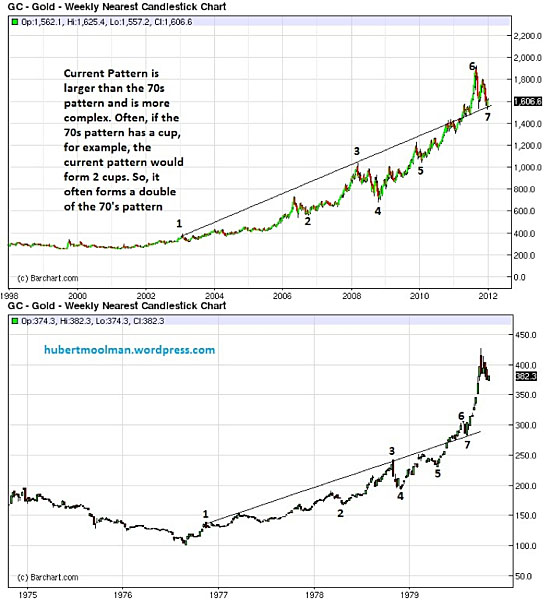
The current pattern is much larger than the '70s pattern and also more complex. I have marked both patterns (1 to 7) to illustrate how the patterns could be similar. If my comparison is justified then we will have a massive rally over the next months.
The following chart illustrates the existence of a short-term fractal (pointed out by one of my readers) that confirms the bullish expectation suggested by the long-term fractal above.
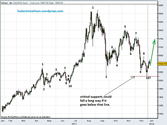
On the gold chart, I have indicated two patterns by marking similar points (1 to 10) on both. The two patterns are very similar looking. If the similarity continues, we will have a massive rally (in fact, it suggests that we are already in that rally).
So where does this leave us? It would appear that gold is looking extremely bullish, as you can see in the above chart. If my comparison of the patterns is accurate, then gold should rise like it did from July 1 to August 23, 2011; however, this time the move would be much bigger and with much more momentum.
For more of this kind of analysis, see my Long-term Gold Fractal Report or subscribe to my premium service.
Warm regards, Hubert


